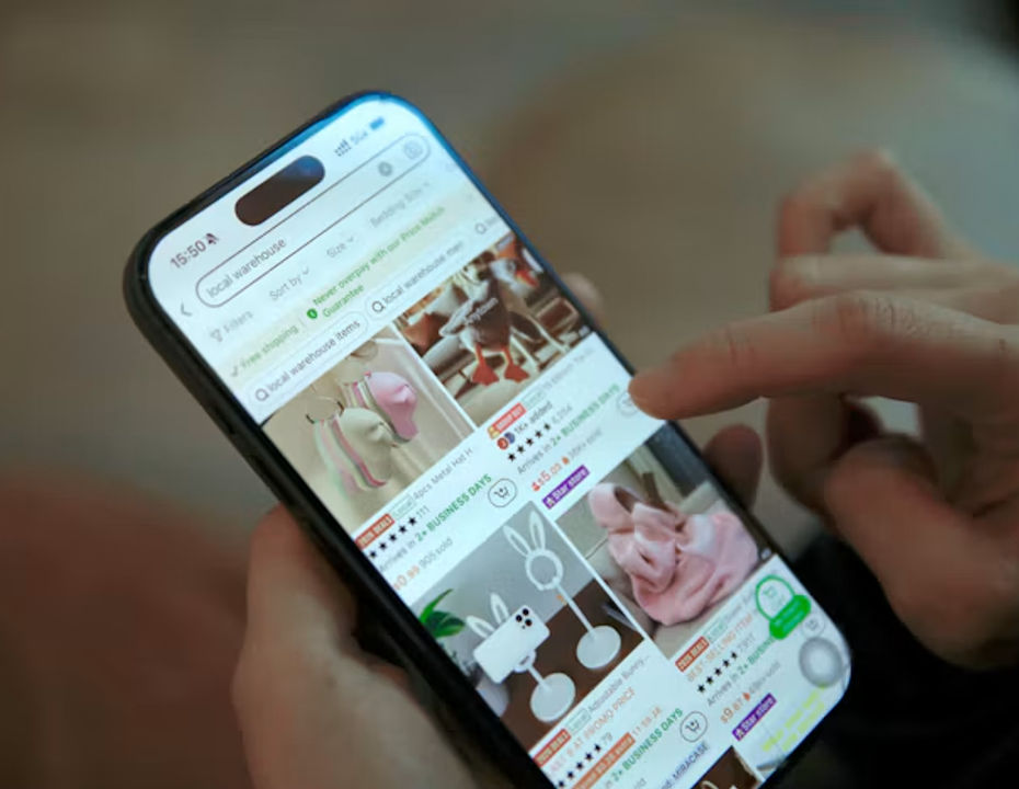
Preview in:
A well designed “find similar” pattern gives shoppers a clear next step, while a poor one shows a random row of products. The difference lies in understanding what similarity shoppers want, where they expect it, and how honestly the interface explains its suggestions.
Three Kinds of Similarity, Three Different Jobs
The phrase "similar products" hides at least three distinct shopper intentions. Treating them as one is the most common design mistake.
Visual Similarity
The shopper likes how something looks. They want the same silhouette, pattern, or style, perhaps at a different price. The similarity search compares images and visual attributes, which makes it especially valuable in fashion, furniture, home decor, and jewelry, where appearance drives the decision.
Feature Alternatives
The shopper cares about specifications. They need a laptop with similar memory and screen size, or a stroller with the same folding mechanism. Here, matching depends on structured catalog attributes rather than images, and the interface should make the comparison of key features obvious.
Personal Recommendations
The shopper has not asked for anything specific, but their behavior suggests interests. Personal recommendations draw on browsing and purchase history. They can be helpful, but they answer a different question than "show me something like this."
Clear labeling matters. "More in this style," "Similar specs," and "Picked for you" set very different expectations, and shoppers trust interfaces that tell them which job each section is doing.
Defining the Pattern Before Building It
Strong find similar products UX starts with decisions, not code: which similarity type each category needs, where entry points live, how results are explained, and what happens when an item cannot be purchased. Answering these questions early prevents a recommendation interface that looks polished but behaves inconsistently across the catalog.
Store teams turning these decisions into working features often partner with a custom software development company, and experienced builders tend to begin with the catalog rather than the widget. A product engineer at SoftDoes said, "Similarity is only as good as the product data behind it. If attributes are missing or inconsistent, no interface can make the results feel trustworthy."
Where the Button Belongs

Placement should follow the moment of doubt.
- On product pages, place the entry point near the main image or close to size and color selectors, where hesitation usually happens
- On product cards in listings, a small icon or text link lets shoppers branch out without opening every product
- On mobile, keep the control within easy thumb reach and avoid hiding it behind menus or long scrolls
- On sold out items, make the option more prominent, since the shopper now has a concrete reason to look elsewhere
Use plain, action oriented labels such as "Find similar" or "See alternatives." Avoid clever wording that forces shoppers to guess.
Implementing Visual Search Technology
To powers visual similarity features effectively, e-commerce platforms increasingly rely on specialized reverse image lookup and visual recognition engines. Integrating tools built around deep learning allows systems to analyze product images by texture, pattern, shape, and color rather than relying solely on manually tagged text metadata. Platforms like lenso.ai demonstrate how advanced image recognition algorithms can match visual patterns instantly, helping shoppers locate exact style alternatives across large, image-heavy inventories even when attribute tags are missing.
Explaining the Results
Shoppers are more comfortable with suggestions they understand, so every product recommendation interface should include short explanations that help them judge relevance quickly:
- "Similar shape and color"
- "Same screen size, lower price"
- "Because you viewed outdoor jackets"
Harvard Business Review research on why algorithm generated recommendations often fall short shows how systems that infer preferences purely from clicks can misread what people actually want. It's the reason to keep explanations honest and specific.
Filters That Respect Intent
Similar results should not be a dead end. Let shoppers refine them with a small set of relevant filters, such as price range, size, color, brand, or a few key specifications. Keep the original product visible as a reference point, and preserve filter choices when shoppers move back and forth. Too many filters on a small screen recreate the overload the feature was meant to solve.
When Products Are Unavailable
Unavailable products are where this pattern earns its keep. Thoughtful behavior includes:
- Clearly marking the item as sold out before shoppers choose a size
- Showing in stock alternatives that match the attributes they selected
- Offering a back in stock notification for shoppers who prefer to wait
- Excluding unavailable items from similar results entirely, so suggestions never lead to another disappointment
This is a core part of good ecommerce product discovery: every path should end with something the shopper can actually buy, or a clear way to wait for it.
Testing on Mobile and Tracking What Matters
Most browsing now happens on phones, so test the full flow there first. The Entrepreneur guidance on testing the path from product page to cart on your own phone reinforces how many small barriers only appear on a real device.
Then measure meaningful transitions rather than vanity clicks:
- How often shoppers open similar results from each entry point
- Whether they view a suggested product in detail
- Whether they add a suggested item to the cart or wishlist
- How often they return to the original product or abandon the session
Treat these signals as evidence for improving the experience, not as guaranteed revenue. The feature's value depends on your catalog, audience, and data quality, and honest measurement will show where it helps and where it does not.
The Development Team's Role
Behind a simple button sits real integration work. The development team aligns the interface with:
- The product catalog, ensuring attributes, images, and availability data are complete and consistent
- Search functionality, so similarity results respect the same synonyms, filters, and ranking logic shoppers already use
- Analytics, capturing clean events for each transition so the team can evaluate changes reliably
Without this alignment, similar results can contradict search results, show unavailable items, or produce data nobody can trust.
How to Choose the Right Development Partner
Assess Past Case Studies and Experience
Look for partners who have built search, filtering, or recommendation features for online stores. Ask how they handled incomplete product data, visual similarity search across large image libraries, and inventory updates.
Evaluate Tech Stack Alignment
Your feature must work with your ecommerce platform, product information system, search engine, and analytics tools. Confirm the vendor's experience with these systems and how their approach scales as your catalog grows.
Establish Communication Protocols
Agree on sprint cadence, demo schedules, and decision makers early. Involve merchandisers and designers in reviews so similarity logic reflects how your customers actually shop.
Ensure Cost and Process Transparency
Request phased estimates with clear assumptions, especially around data cleanup, which is often underestimated. A trustworthy partner explains tradeoffs plainly and avoids promising specific sales outcomes.
Plan for Maintenance After Launch
Catalogs change, seasons rotate, and shopper behavior shifts. Define support response times, monitoring responsibilities, and a roadmap for refining similarity rules based on real usage.
Helping Shoppers Find Their Next Best Option
A "find similar" feature succeeds when it understands which kind of similarity shoppers want, appears exactly where they hesitate, explains its choices, and never leads to a dead end. Built on clean catalog data and measured honestly, it becomes a genuinely useful part of the shopping journey.

Author
Guest Post
Content Writer
Continue reading
General
Best AI photo protection tools in 2026
Information, and especially photos, spreads online very quickly. And basically, you cannot control it – at least not by checking manually. The best way is to use an AI photo protection tool to prevent any potential misuse or keep an eye on where your photos appear online and in what context. Let’s check out the best AI photo protection tools.

General
7 Steps to Build a More Efficient Digital Workflow for Your Team
Every team has its own workflow. This process is usually not well thought out. It’s not created as a finished, ready-to-use item, but develops through the process of formation through spreadsheets, everyday messaging applications, informal agreements, and accumulated experience.

General
Visual Product Education: 6 Ways Ecommerce Brands Can Use Images to Build Customer Confidence
High product understanding is a direct prerequisite for high purchase intent. That’s why ensuring your target audience understands your solutions and their value is essential for guiding them toward conversion. However, communicating product benefits can be slightly more challenging online than in-store.

General
The Best Reverse Image Search for Photographers. Set Up Copyright Notifications!
If you are a photographer looking for a smart way to find your copyrighted content shared online, this is the place for you! In this article, we will explain how you can search for your photos being reposted, and the best ways you can automate the searching.

General
Face Search API by lenso.ai for businesses: Top 5 Industries and use cases
If you run a business and wonder how to boost your user engagement or add a feature that may become a game changer – we do have a solution! You need to implement the face search API from lenso.ai. Check whether your use case may be a good fit for reverse face search integration.